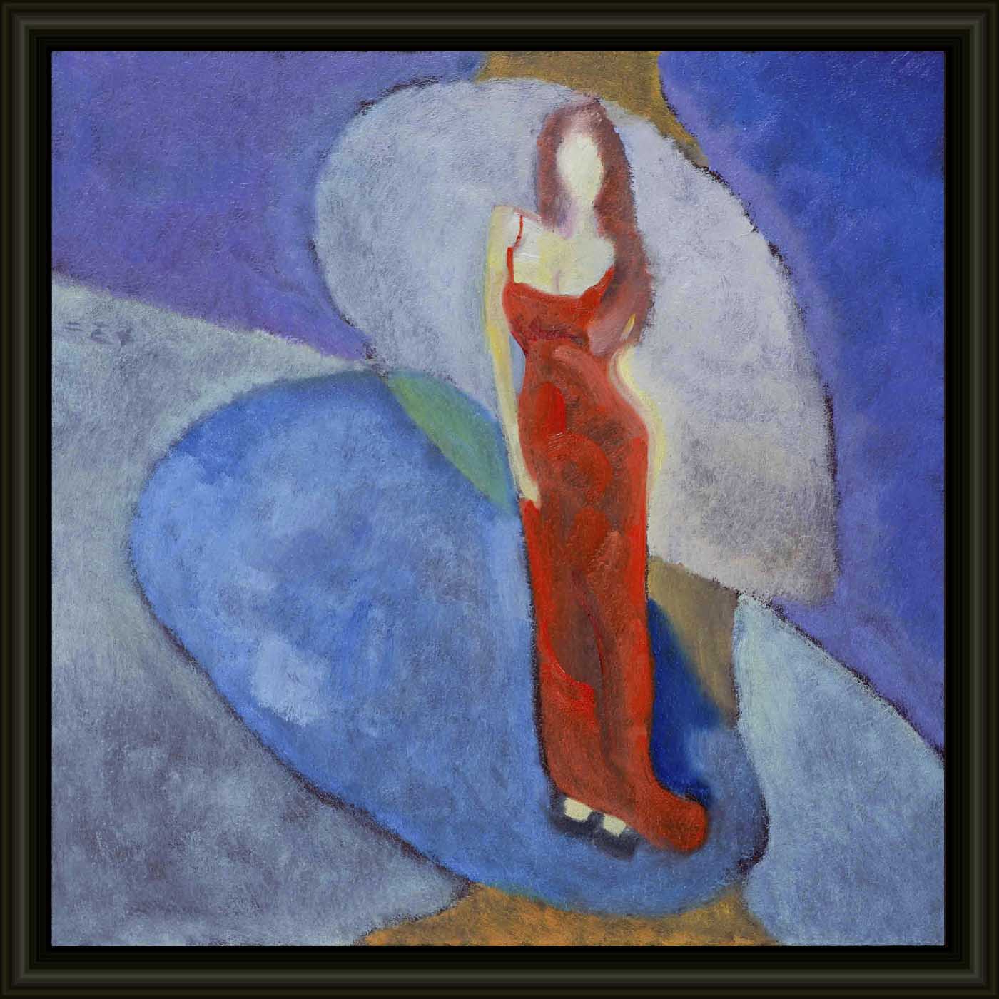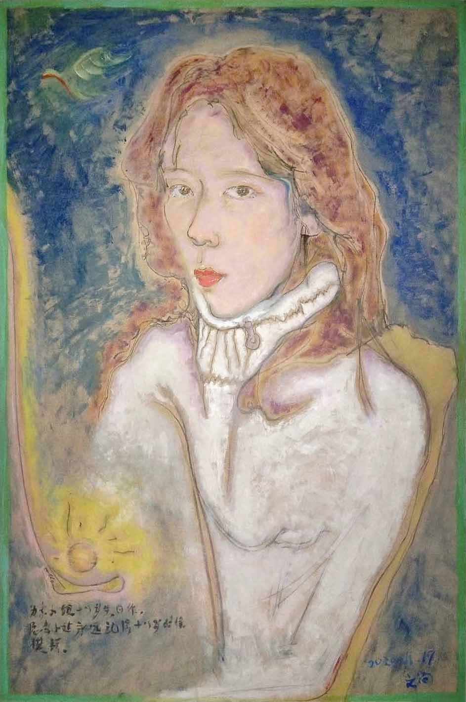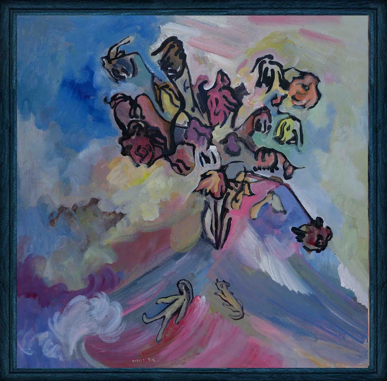
The theme of this year's painting clearly states one - the makeup of desire. People's various desires are wrapped under various makeups. Desires are the intertwining of happiness and pain in life. Either straightforward or subtle, they will appear in makeup, forming a profound look of an era.
Inches: 15.7 x 15.7 in
Size without the frame: 40 x 40 cm
Country: China
Date: 2025
Materials: Acrylic and oil painting on board
Condition: well preserved
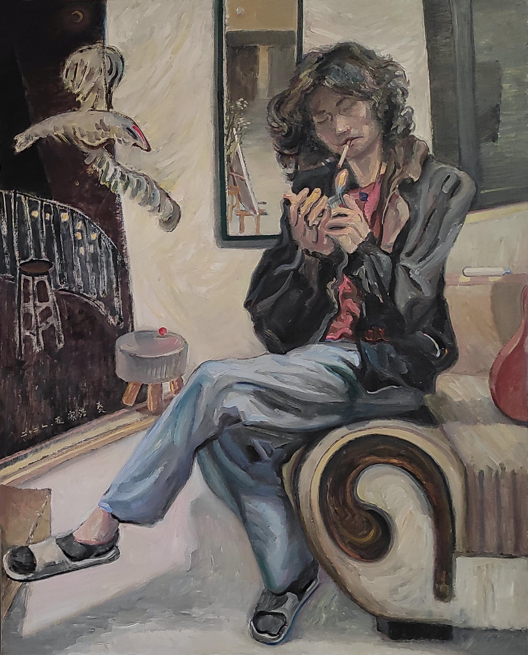
Creative themes and style | My works revolve around the creative concept of "The land of humanity, and the people upon it" . The people in the painting are people in nature, and the lines, shapes, and colors are close to nature. The nature in the painting is nature in the eyes of humans, existing in interaction with humans.I don’t pursue a series of works with a fixed and continuous style. I hope that the style of the pictures will synchronize with the changes in my life and always remain oscillating. The performance of the work must be in sync with the development of one's own life in order to be Sincere and powerful.Ideas are later.
An Interview with Artist Philo by Artphiloso Gallery
If you would like to collect this artwork or know more about the artist, please contact us.
Overall Impression
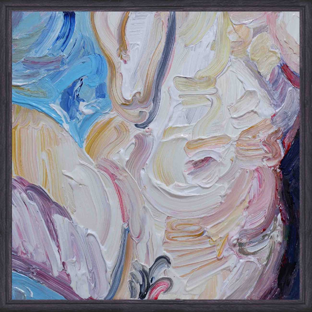
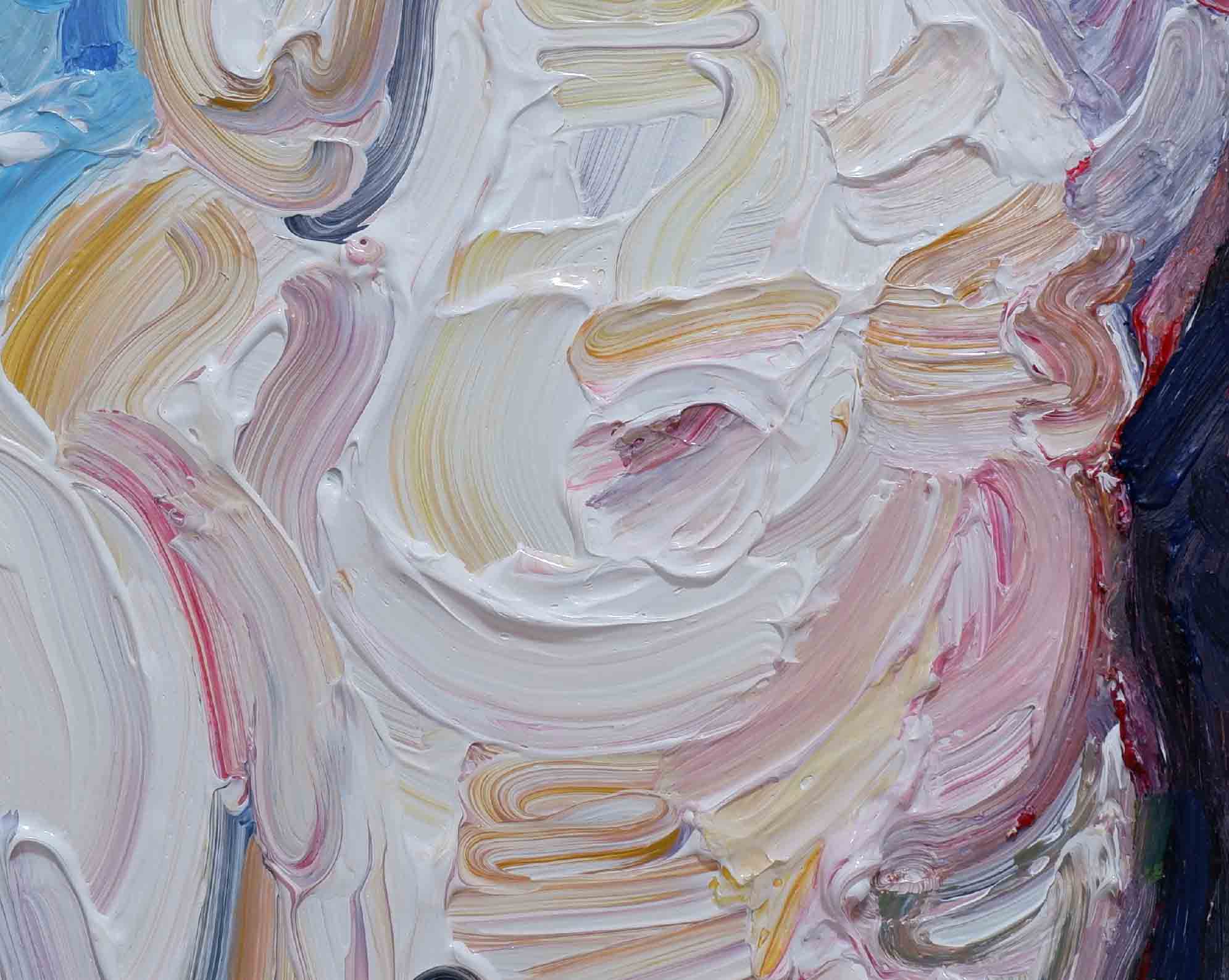
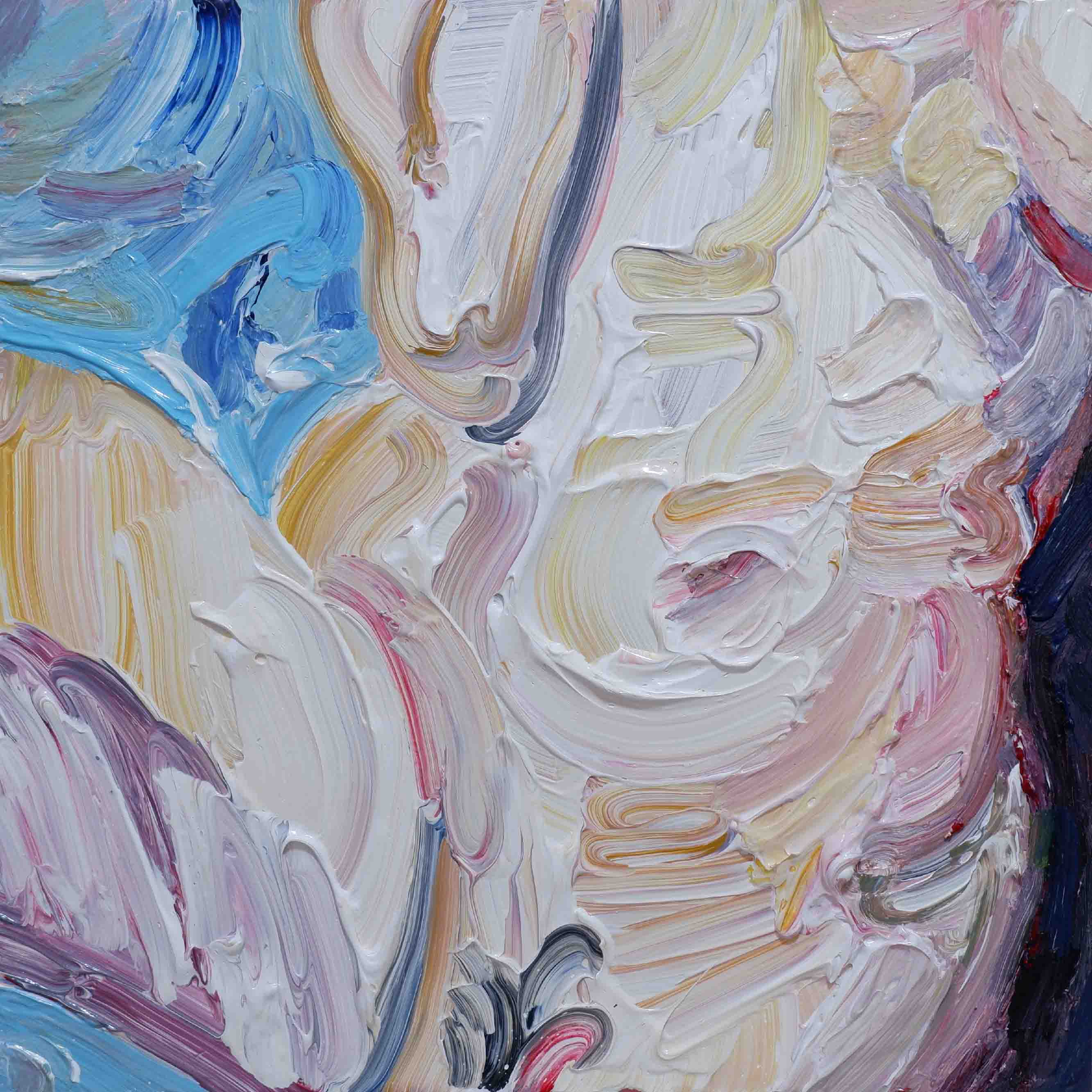
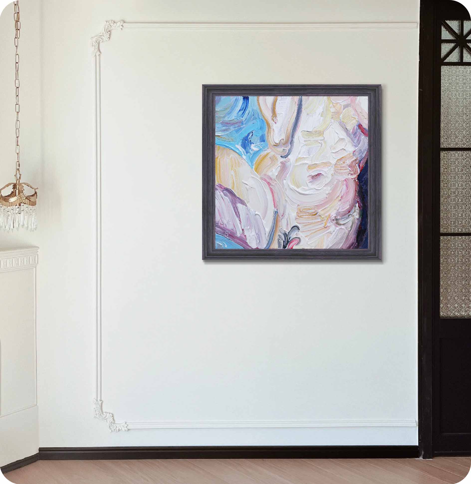
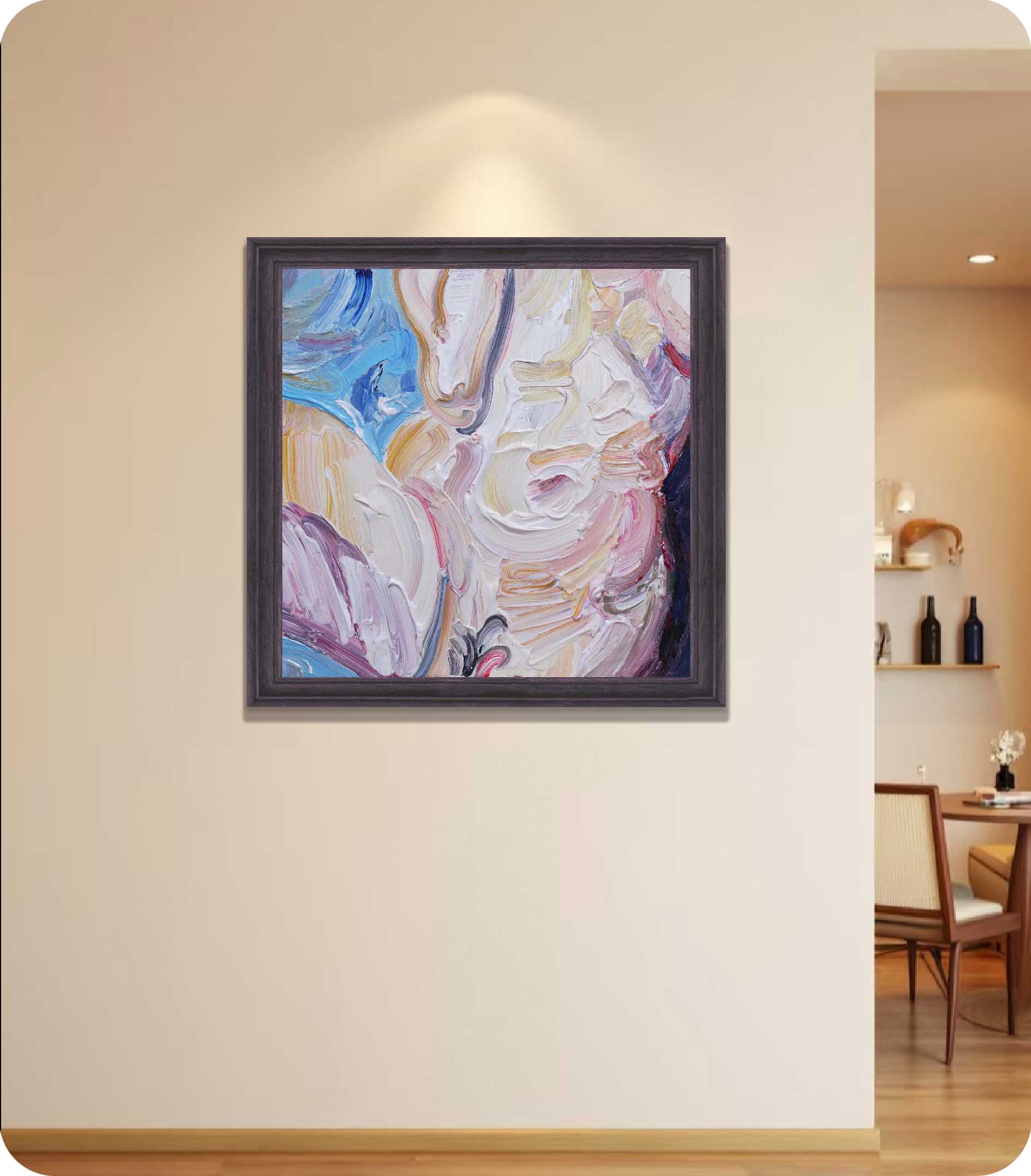
This is a painting built upon the grammar of impasto, structured by the interplay of cool and warm hues, and driven by rhythmic brushwork that shapes emotion. The canvas centers on creamy whites intertwined with peach, ochre, lavender gray, and pale pink. A bright blue passage in the upper left acts as a “breathing space,” while a darker purple mass on the right anchors the composition. Within this square format, the work oscillates between density and openness, creating an energetic equilibrium.
Subject and Reference: The Semi-Figurative “Skin of Summer”
The title A Restless Summer suggests season and agitation. Rather than depicting recognizable objects, the artist evokes tactile associations through “skin-like tones”—pink, ivory, and beige—that recall the sensation of warmth, perspiration, and sun-flushed skin. Certain curved passages resemble a shoulder, a neckline, or folds of fabric, hovering between abstraction and figuration, echoing the Abstract Expressionist tradition of “writing the body through paint.”
Form and Brushwork: Sweeps and Hooks
Impasto is the true subject of this work. Layer upon layer of “C-shaped sweeps” and short hooked strokes interlock, leaving behind raised ridges and furrows. In places, the artist drags back against the wet paint, exposing undertones and creating micro-topographies. Each stroke resembles a quickened breath, collectively building the restless rhythm of summer.
Composition: Triangular Balance and Central Vortex
The composition is structured by three anchors: the cool blue in the upper left, the swirling white core in the center, and the darker violet wedge on the right. The blue cools the surface, the white swirl radiates energy, and the violet wedge stabilizes the movement. Though the square canvas is inherently neutral, directional brushwork generates a sense of spiraling inward and expanding outward, giving the small format surprising spatial vitality.
Color: Warmth Contained by Coolness
The whites are not plain titanium but complex mixtures infused with ochre, pink, and gray. The peach and rose passages are moderated by cooler gray-blue tones that prevent the painting from becoming overly sweet. The nuanced gradations create a sense of lived-in warmth—like sun-tanned leather—rather than flat surface color. The complementary dialogue between the warm center and cool periphery narrates heat rising from within and coolness filtering in from the edges.
Brushwork and Surface: Painting as Low Relief
Here, light is less a matter of color and more a question of surface. The ridges and grooves catch and scatter light differently throughout the day, so the painting subtly changes with shifting illumination. This sculptural quality places the work on the boundary between painting and relief, reminding us of the physical truth of oil paint as material.
Content and Expression: A Rhythm of Restlessness
Restlessness here is not loud or violent, but measured in the frequency of short strokes and their slight directional variations. The blue corner feels like an open window, while the darker violet resembles a doorway or threshold. Together, they stage the quiet drama of seeking airflow within a heated room.
Mood and Modes of Viewing: Touch at Close Range, Rhythm from Afar
Viewed up close, the work is tactile; from a distance, it becomes musical. At arm’s length, one sees the grooves, ridges, and chromatic accidents. Step back, and the broader rhythm of cool and warm masses becomes clear. The painting invites viewers to shift between touch-like intimacy and rhythmic overview, creating an active visual experience.
In sum, this work transforms the sticky heat and uneasy pulse of summer into a visible rhythm that can be both touched and felt.
William de Kooning, Woman I — Known for its flesh tones and sweeping hooked strokes, it helps contextualize this painting’s semi-figurative evocation of skin.
Vincent van Gogh, Wheatfield with Cypresses — Shares swirling impasto and complementary contrasts, though this painting internalizes the movement as an indoor heat rather than an external storm.
Claude Monet, Water Lilies (late series) — Comparable in its built-up surface where light dances across paint layers, highlighting how this work uses texture rather than color alone to refract light.
Joan Mitchell, multi-panel abstractions — Resonates with the rhythmic short strokes and breathing structures seen here, emphasizing quick, pulsating gestures.
Zao Wou-Ki, works from the 1970s–80s — His atmospheric interplay of cool and warm tones offers a parallel to this painting’s dynamic yet meditative flow within a modest scale.
Together, these comparisons place the painting within a lineage that bridges Abstract Expressionism, late Impressionism, and modern lyrical abstraction.
A1: The artist uses layered whites—titanium mixed with ochre, pink, and gray—and then drags the paint in reverse, letting undertones emerge. This creates a lived, skin-like quality rather than sterile brightness.
A2: The blue passage is applied with longer, more diluted strokes that reflect light broadly. In contrast with the dense warm tones around it, it reads like a window or vent, psychologically offering relief and openness.
A3: The triangular structure and swirling center amplify movement, while the impasto builds physical weight. The compact format suits hallways, study walls, and gallery-style groupings, where close viewing of texture offers an intimate encounter.
A4: Placing it against neutral gray or natural wood walls allows the impasto surface of this contemporary abstract oil painting to capture changing light. Adding a few accents of deep blue or violet in furnishings can echo the painting’s cooler passages. It fits naturally in living rooms, bedrooms, or workspaces that benefit from quiet emotional release.
A5: Its value lies in three qualities: (1) the uniqueness of its impasto surface, which changes as light shifts throughout the day; (2) its semi-figurative narrative, which balances accessibility with abstraction, making it versatile in both domestic and office settings; and (3) its compact size, which facilitates transport, framing, and display. As a contemporary abstract oil painting, it serves as a meaningful entry point for private collections or as part of a growing system of original works.
What should I pay attention to when buying an artwork or its derivatives?
A: Click here to view ARTPHILOSO's Guide for Collectors.
More paintings from this series:
A Restless Summer 1 A Restless Summer 2 A Restless Summer 3 A Restless Summer 4 A Restless Summer 5
A Restless Summer 6 A Restless Summer 7 A Restless Summer 8 A Restless Summer 9 A Restless Summer 10
A Restless Summer 12 A Restless Summer 13 A Restless Summer 14 A Restless Summer 16