
Capturing the delicate beauty of a flower on canvas or paper is a rewarding artistic pursuit. While seemingly simple, achieving a convincing and aesthetically pleasing floral painting requires careful observation, fundamental technique, and thoughtful execution. This guide outlines a structured approach suitable for various mediums like watercolor, acrylic, or oils.
The foundation of a successful floral painting lies in thorough preparation and close observation of the subject.
Begin by selecting your flower. A fresh bloom with vibrant, intact petals is ideal. Place it in natural light, preferably near a window offering soft, diffused illumination, which reveals subtle color variations and form without harsh shadows. Study the flower intensely. Note its overall shape – is it a single bloom like a tulip or a cluster like hydrangea? Examine the petal structure: count them, observe how they overlap, their edges (smooth, ruffled, serrated?), and any unique markings or veining. Pay equal attention to the stem, leaves, and bud if present. Make several quick sketches in a sketchbook. Focus on capturing the gesture, the basic geometric shapes underlying the complex form, and the negative spaces between petals. This deep observation is crucial before paint touches the surface.

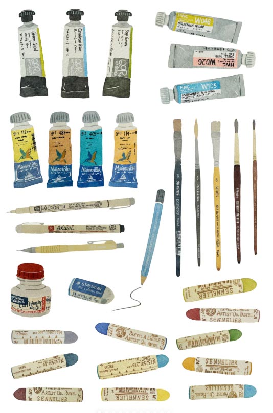
Selecting the right materials for your medium and desired outcome is essential for effective execution.
Choose your support: heavyweight watercolor paper (such as Arches cold-pressed) for watercolors or gouache; stretched canvas or canvas board for acrylics and oils; or quality paper suitable for acrylics. Prepare the surface: watercolor paper may need stretching; canvas for oils typically requires a layer of gesso. Select brushes: a range of sizes including small rounds (sizes 0-6) for details, medium flats or filberts for petals and leaves, and a larger wash brush for backgrounds if needed. Synthetic brushes work well for water-based paints; natural hog bristle is traditional for oils. Prepare your palette with the core colours you observed. A basic floral palette often includes a warm and cool version of red, yellow, and blue (e.g., Cadmium Red, Alizarin Crimson, Cadmium Yellow, Lemon Yellow, Ultramarine Blue, Cerulean Blue), plus greens (Sap Green, Viridian), Burnt Sienna, and Titanium White. Have ample clean water for watercolors/acrylics, and appropriate solvents like odourless mineral spirits for oils. Keep rags or paper towels handy.
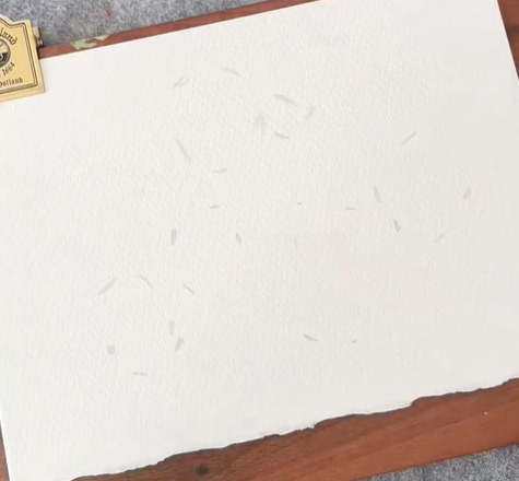
First, plan your composition and lightly sketch the main structure onto your canvas. This will give you a clear guide for applying paint.
Decide on your composition. Will it be a single, centrally placed bloom, a close-up fragment, or an arrangement? Consider the rule of thirds for dynamic placement. Using a light pencil (HB or 2H), very gently sketch the major shapes onto your prepared support. Focus on accurate proportions and the placement of key elements – the centre of the flower, the outermost petals, the stem angle. Keep lines light and minimal, indicating only the necessary structure; avoid heavy outlines that might show through subsequent layers of paint. Indicate the darkest shadow areas lightly. This underdrawing is a guide, not a prison; adjustments can be made during painting.
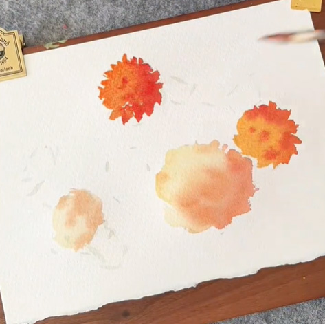
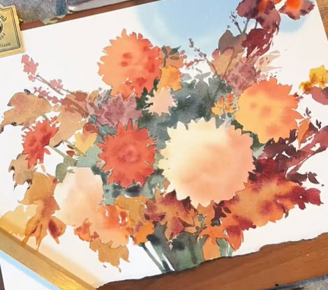
Blocking in the primary masses of color sets the tonal and color relationships that define the flower’s form.
Mix the dominant local colors you see in your subject—the base hue of the petals and the main green of the stems and leaves. Using a medium-sized brush, apply these colors thinly and broadly to their respective areas. In watercolor, this stage is usually a light wash; in acrylics or oils, it can be a diluted layer or underpainting. Don’t worry about detail yet—focus on establishing accurate color relationships and defining the major light and dark areas. Pay attention to the overall shape created by this first block-in.This stage focuses on capturing the fundamental colour masses and establishing the basic light and shadow patterns that model the flower's volume.
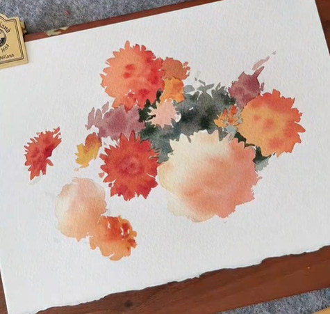
Building form through careful layering of mid-tones and shadows creates the illusion of three-dimensionality.
Once the initial block-in is dry (essential for watercolour and acrylics to prevent muddying; oils allow wet-on-wet but layering is still key), begin developing the form. Mix mid-tone colors – values between your initial light wash and the darkest shadows you observed. Using smaller brushes, start refining petal shapes and leaf structures. Apply these mid-tones where the form turns away from the light source. Gradually introduce shadow colours. Look for the subtle shifts in colour within shadows; they are rarely just a darker version of the local color but often contain cooler or warmer notes (e.g., a red petal's shadow might lean towards violet or crimson). Paint the negative shapes between petals to help define their edges positively. Layering progressively darker tones and refining shapes incrementally transforms flat colour areas into convincing, rounded forms.
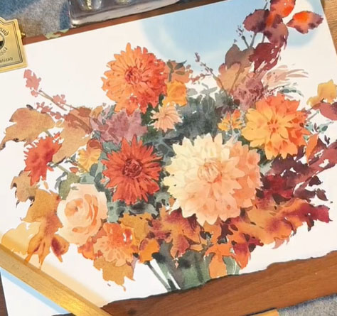
Adding highlights and the finest details brings the painting to life and captures the unique character of the bloom.
Reserve the brightest highlights until later stages. In watercolour, this often means preserving the white of the paper or using masking fluid initially. In acrylics and oils, apply opaque highlights (like Titanium White, sometimes tinted) to the areas catching the most direct light – petal edges, ridges, the very centre of some flowers. Use your smallest brushes sparingly for critical details: delicate stamen tips, tiny veins on petals or leaves (suggest them rather than outlining every one), the precise edge where a petal curls, or the texture of the stem. Observe how light interacts with translucent petals. Applying crisp highlights and selective, restrained details enhances realism and emphasizes the flower's luminosity and delicate structure.
Evaluating the entire work and making final adjustments ensures cohesion and balance before considering the piece complete.
Step back from your painting frequently. Assess the overall composition – does the eye move pleasingly around the image? Is there a clear focal point (usually the flower's centre or a prominent bloom)? Check colour harmony: do the colors work together, or is something jarring? Evaluate the tonal range: are there sufficient darks to make the lights sparkle? Are the shadows convincing? Make any necessary adjustments: perhaps softening an edge that’s too harsh, intensifying a shadow for more depth, adding a subtle glaze to unify colors, or refining a highlight. Consider the background; a simple, soft wash or muted color often works best to make the flower stand out without distraction. Sign your work discretely when satisfied. A final review from a distance, focusing on composition, colour harmony, and tonal balance, allows for refinements that elevate the finished painting.
About Artphiloso
Hi, I’m Philo, a Chinese artist passionate about blending traditional Asian art with contemporary expressions. Through Artphiloso, my artist website, I share my journey and creations—from figurative painting and figure painting to floral oil painting and painting on landscape. You'll also find ideas for home decorating with paint and more.
FAQ
What are the best brushes for painting floral details?
Small, high-quality round brushes (sizes 0 to 4) with a good point, often sable or synthetic sable, provide the control needed for fine petals and stamens.
How important is the paper or canvas quality?
Crucial; heavyweight, textured watercolor paper like Arches or Fabriano handles washes well, while primed canvas or linen provides the right tooth for oils and acrylics.
Can I paint flowers effectively from a photograph?
Yes, a clear, well-lit photograph is a good reference, especially for fleeting blooms, but direct observation captures subtler colour and depth nuances.
How do I achieve realistic petal transparency with watercolour?
Apply light, layered washes, allowing each to dry completely, and preserve the brightest highlights as the white paper.
What's the key to painting convincing green foliage?
Avoid pure tube greens; mix greens from blues and yellows, adding reds or browns to grey them, and observe the wide value range within leaves.
How can I paint white flowers without them looking flat?
Use very pale tints (grey, blue, yellow, pink) in shadows and mid-tones; reserve pure white only for the most intense highlights.