
Low or sloping ceilings pose a design hurdle, compressing vertical space and altering light dynamics. Yet these architectural quirks can become creative features when handled with intention. Hanging art in such rooms is not about obeying rigid rules—it is about building visual harmony between structure, function, and aesthetics.
In rooms with limited height, art must speak the language of balance, proportion, and spatial dialogue.
Begin by reading the room as a visual composition. A low ceiling naturally encourages lateral movement of the eye, so artwork should support that flow. Use color continuity, texture, and framing decisions to smooth transitions among walls, furnishings, and ceiling planes.
Painting the ceiling and walls the same or closely related hue (especially with a matte finish) removes harsh divides and tricks the eye upward. If you prefer variety, carry patterns—like wallpaper or wall paneling—up to the ceiling line. In lofts or attic spaces with steep slopes, this continuity reduces the “boxed-in” effect.
Introduce vertical rhythm subtly through art series, linear frames, or soft stripe accents. Vertical repetition can gently lift the space without demanding structural changes.
A consistent palette and directional structure can visually expand a low-ceiling room upward and outward.
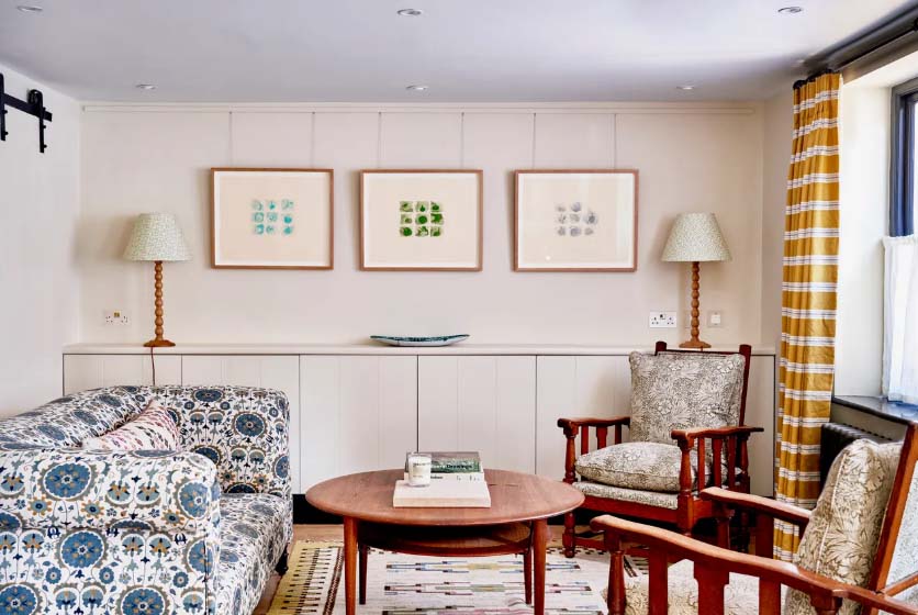
In conventional interiors, art is often centered at 57–60 inches above the floor. But in low-ceiling rooms, such placement can feel disconnected. Instead, calibrate height based on seating posture and the scale of surrounding furniture.
If a sofa back is 32 inches tall, set the bottom edge of the frame about 6–10 inches above it. This keeps the art tied to the furniture visually and prevents awkward blank space. Although this may locate artwork below standard “eye level,” it aligns with how the space is used—often from a seated point of view.
Hanging lower than typical may feel unconventional, but it ensures the art participates in daily life rather than floating out of reach.
Lowering artwork height in constrained rooms aligns visual comfort with real usage instead of arbitrary design rules.
Every room contains implicit anchors: door frames, window sills, mantels, chair rails. Use these existing lines to ground your art layout. In rooms with limited vertical height, precise alignment is essential to visual calm.
Align edges of frames with tops of sideboards, headboards, or key trim lines. That way the art becomes part of the architectural rhythm. In rooms with sloped ceilings, locate the “break point” where wall meets slope. Hang artwork just below that line to avoid awkward compression.
You can also echo diagonal lines with a tilted arrangement of smaller works, making the slope feel intentional.
Strong horizontal and architectural alignments stabilize spaces where height and angles feel unstable.
While the original House & Garden piece endorsed clustering small works, balance is subtler than “small vs. large.” Focus on proportional relationships relative to available wall area.
On a wide but low wall, a single panoramic work fosters calm continuity. On a narrow segment under a slope, a vertical diptych or triptych emphasizes height where it is present. Large-scale works are permitted, but surround them with breathing space so they do not overwhelm.
Avoid overcrowding a short wall with many tiny frames. Instead, let clusters share a tonal or thematic connection so they read as one visual unit. Maintain consistent spacing (1.5–2 inches) to retain rhythm.
Proportional scale and visual rhythm—not frame size alone—dictate effective composition in tight spaces.
Low ceilings often face the drawback of reduced natural light. To compensate, control how light interacts with frames, glass, and finishes.
Use directional lighting—wall sconces, picture lights, or track spots—to highlight art selectively. Avoid placing light too close, which may distort color or create hotspots. Choose matte glass or nonreflective acrylic to prevent glare, especially opposite windows or skylights.
Mirrored or metallic frame accents can bounce ambient light into dim corners. In rooms with sloped skylights, place art on adjacent vertical walls rather than directly beneath beams to reduce exposure and protect materials.
Strategic lighting and reflective accents can transform limited vertical space into an intimate gallery ambiance.
Gallery walls work well for low or angled ceilings, but structure and coherence are essential.
Begin with a central anchor piece at a stable height, then radiate outward in symmetrical or rhythmic patterns. Keep the highest piece at least 10–12 inches below the ceiling or slope junction. Use templates or paper outlines taped to walls to fine-tune layout before making holes.
Blend media—photographs, paintings, prints—and hold them together through palette or subject. Avoid haphazard arrangements; strive for visual flow.
A deliberate, cohesive gallery wall transforms ceiling constraints into a curated design feature.
Frame selection dramatically influences how art “sits” in a low-ceilinged room. Lightweight frames soften visual weight; oversized mats introduce spatial breathing.
Floating mounts, shadow boxes, or frameless acrylic enclosures give a sense of depth and allow the art to hover gently from the wall. Dark frames visually anchor a composition; light wood or metal reflects ambient light.
For sloped ceilings or brittle drywall, use ledges or picture rails that allow art to lean or be swapped without damaging surfaces.
Well-chosen framing techniques can introduce visual depth and flexibility in compressed vertical environments.
When vertical expansion is limited, emphasize depth through contrasting textures and materials. Combine smooth walls with linen canvases, raw wood frames, woven pieces, or ceramic art.
Layer types—framed artworks, textile wall hangings, sculptural pieces—so the wall reads in depth as well as width. In narrow low-ceiling corridors, alternate textures to guide the eye laterally and create a sense of expansion.
Texture and material contrast distract attention from height constraints and invite sensory engagement.
Do not shy away from structural features—embrace them. Beams, alcoves, and nooks become compositional elements.
A small artwork tucked between roof beams can create an intentional vignette. Use natural intersection lines of walls and roofs to frame art. Install narrow picture rails aligned with ceiling slope for flexible installation. Full-length ledges allow rotating arrangements and layerable flexibility.
In extreme cases, continue artwork from floor to beam to celebrate the room’s intimacy.
Integrating structure into the art layout turns architectural constraints into expressive features.
Sometimes it is advantageous to acknowledge, not defeat, a low ceiling. Art filling from baseboard to beam can highlight cozy character. Use deep tones or textured surfaces to enhance warmth and depth.
Sloped ceilings tend to draw the gaze inward, creating a cocoon effect. Lean into that: tightly spaced artwork or rich palettes foster refuge-like comfort. Alternatively, minimalist arrangements with generous negative space amplify calm.
By embracing low ceilings rather than disguising them, you can turn them into distinctive spatial assets.
Every room has its quirks—uneven beams, wall vents, ceiling offsets. The strongest designs evolve through iteration, not blind rule following.
Use removable adhesive hooks or paper templates to test layouts. Evaluate from both standing and seated perspectives, with natural and artificial light. Tweak until art, furniture, and architecture feel integrated.
Design thinkers in Elle Decor or Architectural Digest often stress that an interior’s vitality lies in its evolution—not its absolutes.
Iterative experimentation fosters harmonious results far more than rigid adherence to rules.
Hi, I’m Philo, a Chinese artist passionate about blending traditional Asian art with contemporary expressions. Through Artphiloso, my artist website, I share my journey and creations—from figurative painting and figure painting to floral oil painting and painting on landscape. You'll also find ideas for home decorating with paint and more.
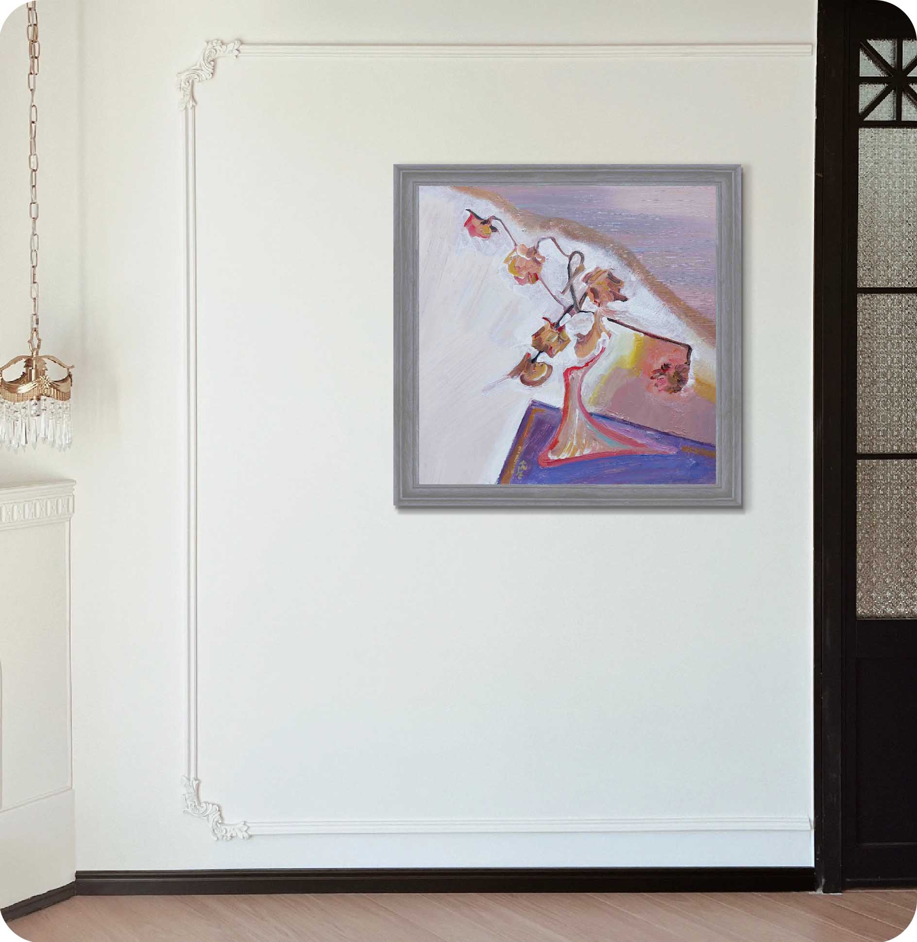
Use your furniture—sofa, bed, cabinet—as a visual baseline. Position art 6–10 inches above the furniture top rather than aiming for a fixed midpoint height.
Use mirror plates or angled hooks. Alternatively, install a picture rail following the slope, or lean artwork on ledges rather than fixing it rigidly.
Select by wall shape: wide low walls suit grouped layouts; narrow segments suit singular pieces. Aim for proportional harmony within the space.
Avoid direct exposure to sunlight. Use UV-filtering glass, allow wall–frame air gaps, and position art away from direct beams.
Cut paper templates of your art and tape them in proposed positions. Step back, assess from seated and standing viewpoints, adjust before making holes.
In every low or sloped room, art is not secondary decoration—it is architectural dialogue. When curated thoughtfully, it transforms restriction into intimacy, asymmetry into rhythm, and low ceilings into character.