Valentine’s Day brings a predictable wave of roses, heart-shaped packaging, and red-toned decorations. Yet the symbolic language of color that underlies these traditions evolves across cultures, industries, and personal relationships. Contemporary celebrations expand far beyond classic red and pink, especially as global audiences reinterpret the meaning of a lover’s day color through personal style, design aesthetics, social media habits, and cross-cultural influences. Understanding valentine’s colors with more nuance allows individuals and brands to communicate emotion through a wider spectrum, making Valentine’s Day more inclusive and expressive.
Understanding Valentine’s Day colors creates more intentional and meaningful emotional communication.
Red remains the most recognizable lover’s day color across mainstream markets. In many U.S. traditions, red symbolizes devotion, romantic love, and enduring attraction. Floral retailers, fashion brands, and hospitality venues treat red as a core valentine’s day color because it carries strong emotional recall and immediate recognizability.
Beyond its commercial use, red holds cultural significance that shapes how people interpret it. In East Asian traditions, red relates to celebration and vitality, adding layers of good fortune to Valentine’s Day exchanges. In the Hispanic cultural sphere, red may also express sincerity and loyal affection. Contemporary American couples use deeper shades such as burgundy or garnet to evoke maturity and long-term commitment, while bright crimson signals intensity and energy.
In personal gift-giving, red works effectively for engagements, anniversaries, or established relationships because its symbolism is stable across most social contexts.
Red communicates passion and commitment with strong cultural continuity and emotional clarity.
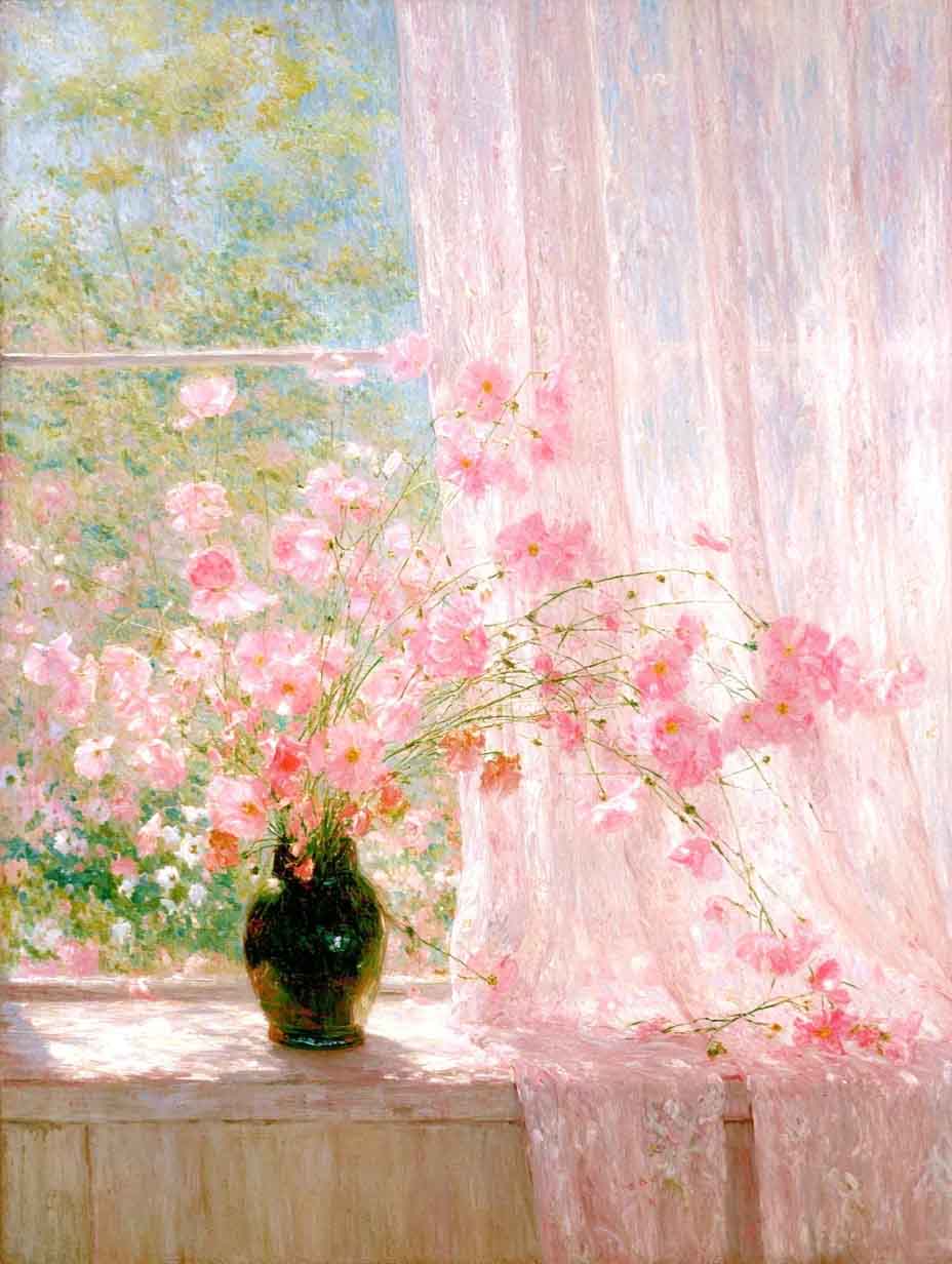
Pink is widely associated with gentle affection, gratitude, and early-stage romance. While red conveys depth and intensity, pink suggests tenderness and emotional openness. Brands across sectors such as confectionery, stationery, and beauty use soft pink as a defining element of February packaging because it resonates with consumers seeking subtle, welcoming sentiments.
Different tones deliver different messages. Blush pink signals appreciation or admiration. Rose pink fits friendships and supportive relationships. Hot pink evokes bold confidence and a modern, fashion-driven interpretation of Valentine’s Day. Younger consumers gravitate toward saturated pinks because they align with digital aesthetics popularized on Instagram, Pinterest, and other visual platforms.
Pink helps express affection without implying long-term commitment, making it accessible for both romantic and non-romantic exchanges.
Pink represents warmth and appreciation while offering adaptable symbolism for diverse relationships.
Orange meaning during Valentine’s Day is often overlooked in traditional guides, despite its rising popularity among younger audiences and design-forward brands. Orange conveys enthusiasm, optimism, and forward momentum. It aligns naturally with beginnings, making it an appealing choice for individuals navigating early dating stages or redefining a relationship.
Contemporary color psychology associates orange with emotional vitality and creativity. In a Valentine’s Day context, it can suggest openness to new experiences and playful connection rather than formal commitment. For this reason, orange appears in modern floral arrangements, restaurant décor, gift wrapping, and fashion pieces that aim to differentiate from the dominant reds and pinks.
In global settings, interpretations of orange vary. Some European markets link orange to joy and sociability, while in South and Southeast Asia it may carry spiritual or ceremonial connotations. These cross-cultural nuances enrich its meaning rather than limit its use.
Orange expresses enthusiasm and creative energy, making it ideal for new or evolving relationships.
Purple offers a sophisticated alternative within valentine’s day colors. Its long association with luxury, introspection, and artistic temperament makes it suitable for individuals who prefer understated elegance. Dark purples suggest depth and emotional complexity, while lavender tones express calmness, trust, and emotional care.
Brands in sectors such as artisan chocolate, boutique hospitality, and luxury gifting often utilize purple to stand out visually among saturated red-pink environments. On platforms like Etsy and Behance, independent designers frequently pair purple with metallic accents to communicate refinement.
Purple also carries rich cultural symbolism. In Mediterranean and Middle Eastern contexts, purple represents wisdom and noble affection. In the U.S. creative community, purple often signals individuality and imagination.
Purple conveys depth, creativity, and an elevated interpretation of romantic intention.
White operates as a balancing shade among valentine’s colors. It represents sincerity, transparency, and fresh beginnings. Contemporary couples influenced by minimalist design trends adopt white as a primary Valentine’s Day palette, especially in table settings, floral arrangements, and curated gift sets.
White pairs well with every other lover’s day color, creating contrast and visual calm. Its symbolism varies across cultures, but on Valentine’s Day it generally suggests honesty, clarity, and respect. White roses, white candles, and white stationery dominate many modern wedding-adjacent celebrations during February.
In design-driven regions such as Scandinavia, white remains a foundational romantic color because of its clean aesthetic and emotional neutrality.
White communicates sincerity and clarity while supporting minimalist or modern Valentine’s Day expressions.

Black is increasingly recognized as a modern valentine’s day color within fashion-driven and cosmopolitan communities. It suggests depth, confidence, and emotional intensity rather than negativity. High-end restaurants, jewelry brands, and editorial publications such as Vogue often incorporate black into Valentine’s Day imagery to signal elegance and contemporary appeal.
For some couples, black reflects mature romantic identity or shared creative interests. For others, it serves as a grounding color that pairs well with metallics, jewel tones, and warm hues.
Black should be used with intention because it can communicate strong emotional boundaries or independence.
Black introduces sophistication and emotional intensity for modern, design-oriented Valentine’s Day aesthetics.
Metallic shades—especially gold—carry connotations of celebration, continuity, and meaningful milestones. They appear in jewelry, packaging, typography, and interior settings during Valentine’s season. Gold highlights stability and value, making it an appropriate choice for long-time partners or couples marking anniversaries.
In branding, gold signals premium quality and reinforces festive environments. It functions effectively alongside red or purple to create refined compositions. Metallics resonate strongly on visual-first platforms such as TikTok, where reflective surfaces enhance digital presentation.
Gold and metallic tones highlight lasting commitment and contribute to elegant Valentine’s Day design.
While the American interpretation of valentine’s day colors remains influential, global communication reshapes how colors are applied. In Latin American countries, variations of yellow and orange often express friendship during February events. In several European regions, deep blues occasionally appear in gifting traditions to symbolize trust and loyalty.
Generational differences also guide color choices. Gen Z consumers adopt saturated hues and unconventional palettes, while Millennials and older groups often favor muted tones and natural textures. Social media aesthetics drive experimentation, leading to Valentine’s palettes that combine traditional symbols with contemporary sensibilities.
Cultural and generational variations broaden the symbolic vocabulary of Valentine’s Day colors.
Color selection influences how gifts are perceived. Red or gold wrapping communicates formality and commitment. Pink packaging suits supportive relationships. Orange or bright tones support casual exchanges and creative gestures. Minimalist white or metallic schemes elevate luxury goods and curated experiences.
Interiors also benefit from careful color planning. Restaurants may use warm tones to encourage intimacy, while event planners implement purples or metallics for elevated ambiences. Fashion styling for Valentine’s Day follows similar principles, balancing personal expression with symbolic intention.
For digital content creators, valentine’s colors contribute to narrative consistency. Influencers on YouTube, Instagram, and TikTok rely on cohesive palettes to enhance visual storytelling and emotional tone.
Intentional color planning strengthens Valentine’s Day communication across physical and digital environments.
Hi, I’m Philo, a Chinese artist passionate about blending traditional Asian art with contemporary expressions. Through Artphiloso, my artist website, I share my journey and creations—from figurative painting and figure painting to floral oil painting and painting on landscape. You'll also find ideas for home decorating with paint and more.

1. What do traditional Valentine’s Day colors represent?
Traditional colors like red and pink express affection, passion, and warmth. Red symbolizes commitment and romantic depth. Pink reflects appreciation and gentle emotion.
2. Why is orange becoming more common for Valentine’s Day?
Orange meaning aligns with energy and optimism, appealing to people exploring new or evolving relationships. It works for casual expressions of enthusiasm.
3. How do cultural backgrounds influence valentine’s day colors?
Different regions interpret colors uniquely. Red may express luck in East Asia, while purple signals noble affection in Mediterranean contexts. These variations enrich Valentine’s symbolism.
4. Which colors suit non-romantic Valentine’s Day gifting?
Soft pink, pastel purple, white, and orange work well for friendships, family, or workplace exchanges. These shades offer warmth without implying deep romantic intent.
5. How can brands and designers use color more effectively for Valentine’s Day?
Using broader palettes beyond classic red and pink helps communicate modern identity and emotional nuance. Strategic combinations reinforce storytelling, product positioning, and visual clarity.